Top 20 E-Commerce Landing Page That Will Inspire You
So, you want your ecommerce landing page gets the job done for yourself. But there are a lot of other landing pages that you may find best for your e-commerce website. Different landing pages work differently, and the focuses are different as well. If you want more visitors and generate more revenue, then this article is for you.
There is a theory that tells users can not find the information, and this affects the e-commerce platform, and ultimately it does not get the expected visitors. And then the conversion rate is also low. Users come to check the website, but there is no conclusive brand that they are failed to understand, so the engagement rate becomes low, and it makes fewer conversion rate.
What Is An Ecommerce Landing Page?

So, basically, it is the design of a web page that the sole purpose of a landing page is to increase the conversion rate for an e-commerce website. The main focus of landing pages is to sell products over services. They are mainly created by e-commerce businesses with the goal of selling physical and tangible products.
These pages use elements like trust indicators, social proof, magnetic headlines, and optimized conversion ratios, and there are other elements as well. And the main thing is to compel the visitors to tap on the CTA button. The landing pages contain the information that visitors want and need to know what is there to offer, such as whether to buy or not or to, download or not, etc.
Which One Should You Choose: Product Pages Or Landing Pages
Before coming into the list of different landing pages for your e-commerce website, let’s know the basic differences between product and landing pages. So, product pages are not good for e-commerce best practices. Most product pages contain shiny links, and these links distract visitors rather than compel them to buy.
But, when it comes to landing pages, the focus is to grab the visitor’s attention and not on the whole website, but rather on a single product and lead them to their purchasing journey. There are more customizable, targeted, and, most importantly, have the ability to increase the conversion rate.
Top 20 Ecommerce Landing Page Examples
So, what kinds of things should you expect from your landing page? Here are examples of top landing pages that you can look into.
1. Home Chef
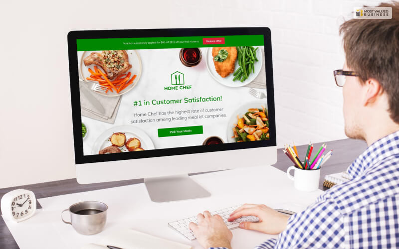
Home Chef is one of the best landing pages that gets the number one rating from a couple of websites. It has a short video, great icons, and bulleted content, and the CTA button is attention-grabbing and bright.
2. Blue Apron

When it comes to Blue Apron, the conversion ratio is 1:1. The CTA button is noticeable and bright, there are featured photos, and you will get so many different features.
3. Verizon

This landing page is one of the best when it comes to portraying important content because there is a white space in the middle, so it is highly visible. Also, visitors get to know all the important information.
4. The Farmer’s Dog
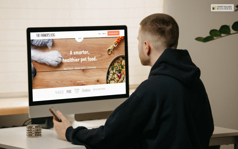
This landing page gives users subheadings, featured images, USDA ingredients, personalized references, and so many testimonials. So you will definitely like this one.
5. Winc
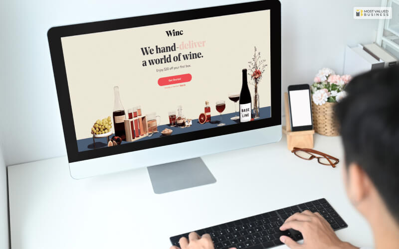
There are small text, logos, featured images, testimonials, and so many small and attractive features that will definitely catch more visitors.
6. GoPro
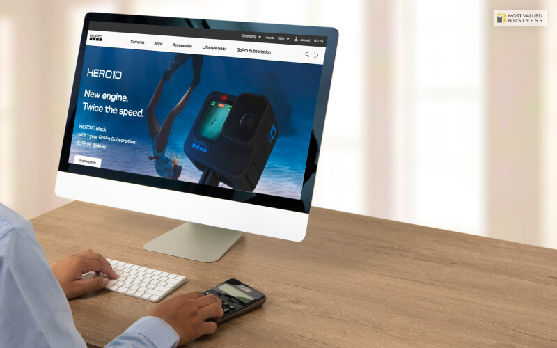
GoPro is one of the best landing pages that have a bright CTA button, spaces for posting stories, subheadlines, and a headline from where users can sign up.
7. Fabfitfun

If you want to post short paragraphs, attention-seeking CTA buttons, small logos, short content, and positive testimonials, then Fabfitfun is for you.
8. Quip
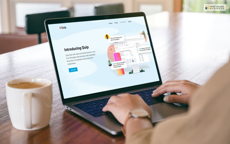
This ecommerce landing page has the feature to give a section where you can write nine reasons to choose your website. There are other features where you can also put reasons.
9. Axis

This landing page is quite different from other landing pages because there are small features like a short video, her shot, headline, and CTA button, and there are many features that you can add.
10. Danielle World

On this landing page, e-commerce platforms can tell a story through their headlines. Other than this, there are testimonials, video-sharing options, copy-giving, and other features to tell stories as well.
11. Casper
When it comes to Casper, the landing page offers you different icons, logos, testimonials, and, most importantly, bite-size copies that are highly popular these days.
12. John Henric
If you want to give discounts and other coupons on your website, then the offer page looks really great. And visitors will be attracted for sure.
13. Tabio USA
Tabio USA is quite a nice landing page, but it has many areas where it has been improved. But, for a starter, you can definitely use it.
14. Flaviar
If you want to give your e-commerce platform a classy look, Flaviar has really something serious for you. In terms of headline, letter, and countdown timer, the platform is great.
15. Hemel
Hemel offers you great featured images and unique headlines that can attract visitors. This way, you can increase the conversion rate.
16. Causebox
If you are looking for something different or out of the box, then you can use Causebox. There are engaging sliders that you may like.
17. Robert Graham
First of all, the squeeze page, the first page where users need to give emails, and the offers are really good. You can try it for once and check whether you like it or not.
18. Freshly
Freshly has icons, logos, testimonials boosts, and some professional pages that you can set into your e-commerce website.
19. BistroMD
The first landing page works quite well. Other than this, the CTA button and headline are really good. You can try this ecommerce landing page.
20. Beach Body
First of all, it focused on conversion rate, which is why the ratio is 1:1. There are testimonials, CTA buttons, subheadlines, and other features as well.
Final Words
If you are interested in other landing pages, then I can give you a couple of more landing page examples. Here are examples for you.
- Ipsy
- Cellular Outfitter
- Watch Gang
- Gwynnie Bee
- Crown Wellness
- Sunglass Warehouse
- Cremo Company
- Spark People
- Ellie
- Fabletics
So, what are you waiting for? Here is your list, you can now start building your ecommerce landing page. But, before choosing one, you must know what feature you want on your landing page. The main focus is ROI, so you must compare on the basis of which one will get you the maximum benefit.
If you have any other queries, feel free to reach us in the comment section below.
Thank You.
Read Also:


